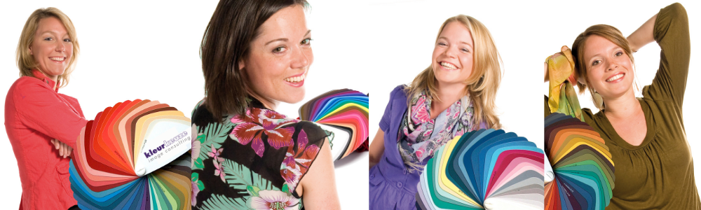


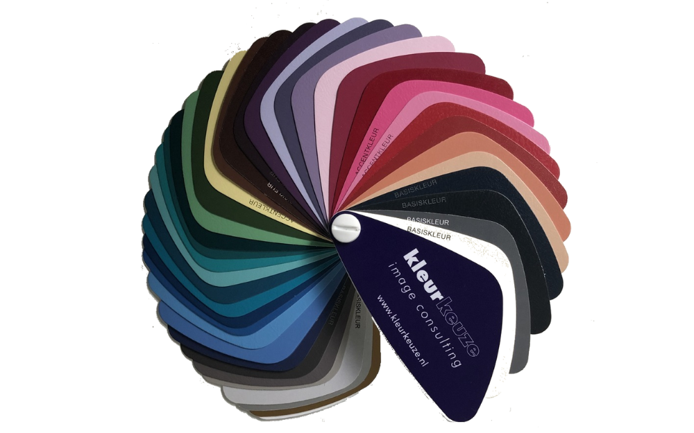
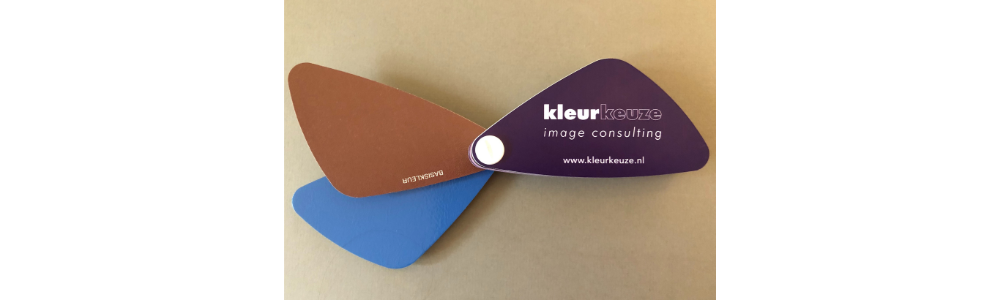
A personal color fan
Below I will explain your personal color palette. After your personal color analysis you have received your personal color fan with 42 colors that suit you personally. There is no one with the same color range because it is completely customized based on your eye color, skin color and hair color. This color palette will make it easier to choose the right color for your clothes, giving you a beautiful appearance and the colors of your skin, hair and eyes will come out better. It will be a lot easier to put together your wardrobe. You will discover that the colors from your fan can all be combined with each other.
“The Whites”
“Whites”
At the beginning of the palette are a number of light colors, the so-called “whites”, although this does not have to be pure white. These are light colors that enliven and enhance other colors.

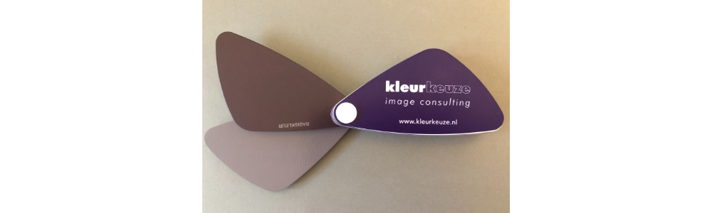
“The Neutral colors”
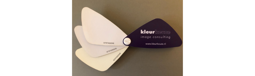
“Basiskleur” “Neutral colors”
These are the neutral colors in your color palette and this is printed on the color card in Dutch “BASISKLEUR”. These can be both dark and light colors. They are very suitable for combining in many ways. These are beautiful colors for basic garments. If you choose the best possible quality, you can use it for a long time. In that case, the style of the garment should not be too flashy.

“The Accent colors”
“Accentkleur” “Accent color”
These are the most striking colors in your color palette and this is printed on the color card in Dutch “ACCENTKLEUR”. They are not only suitable for accents in your outfit, as you might suspect. You can apply accent colors in large quantities. You will be noticed and will be remembered. My advice is therefore not to wear items in your accent colors too often in the same environment, as people will remember this.
There are colored stickers on the back of the fan. The white, green and yellow stickers do a lot for your appearance. These colors are a nice addition to your wardrobe. Below I will discuss them:

The skin tone related color and The skin-enhancing color
The skin tone related color
The skin tone related color is a soft accessible color. In your personal color palette, this color is indicated by a white sticker on the back. This color is very nice to combine with other colors. This nude color is a feminine color and beautiful for tops and blouses. When nudes are in fashion, it is useful to apply this color when purchasing nude-colored clothing such as lingerie.
The skin-enhancing color
The skin tone enhancer ensures a healthy appearance. In your personal color palette, this color is indicated by a white sticker on the back. I love this color myself and if you don’t have it in your closet yet, I would immediately try to buy something in this color.
When you are looking for a new swimwear, this is a beautiful color because you immediately look “sunkissed”.
The eye-catching color and The eye-enhancing color
The eye-catching color
The eye tone color is a calm, approachable, easy-going color that adds extra shine to your eyes. In your personal color palette, this color is indicated by a green sticker on the back. This color works really well when you want to appear approachable. To give your eye color extra strength, it is nice to wear this color in an outfit close to your face. It is also very nice to use this color for your eye make-up such as an eye shadow or an eye pencil. During your personal color analysis I give advice about this during the make-up workshop.
The eye-enhancing color
The eye color enhancer makes the eyes speak more and appear brighter. You will have the greatest effect when this color is worn close to the face. In your personal color palette, this color is indicated by a green sticker on the back.
The hair related color and The hair-enhancing color
The hair related color
The hair tone color gives your hair color a more intense and shiny effect. In your personal color palette, this color is indicated by a yellow sticker on the back. This color is very suitable for leather and suede clothing like jackets, shoes and bags. It is very useful to buy your belt, shoes and bag in this color, since you can combine these items with all colors in your personal color palette.
The hair-enhancing color
The hair color enhancer is especially suitable for coats, jackets or, for example, a plain sweater or blouse. In your personal color palette, this color is indicated by a yellow sticker on the back. It gives your hair color a more intense and shiny effect.
It is nice to combine the hair related color and hair color enhancer with each other. For example, a jacket in the hair related color and a scarf in the hair color enhancer.
When you look at the front of your palette again you will see that there are several kind of colors such as the reds, purples, blues, blue-greens and greens, yellows and metallics. I will discuss these further below:

The “reds”
The “reds”
The reddish colors are colors that contain a lot of red. This does not have to be fire red, but can also be fuchsia, brick red, coral red or burgundy, for example. These reds flatter your skin tone. When you wear these colors you appear active and energetic which can be very useful when you are a bit tired. Red stands for warmth, strength and passion. In red you come across as confident and powerful. They are also nice colors to wear when you literally or figuratively “take the stage” as red holds the attention of your audience.

The “purples”
The “purples”
The purplish colors are soothing, cool and sophisticated. They are often associated with creativity and mysticism.
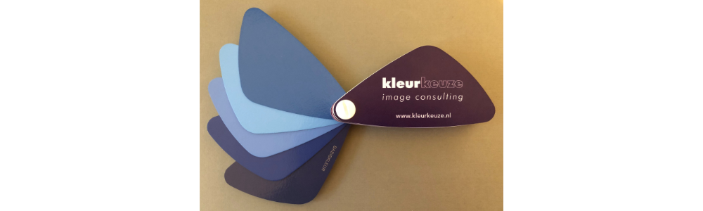
The “Blues”
The “Blues”
Blue colors and certainly dark blue are very popular basic colors. For example, think of the blue of your jeans and jeans. Blue is a calm and confidence-inspiring color. You come across as a serious person in blue. Blue is often worn in formal business environments such as banks and lawyers.

The “blue-greens and greens”
The “blue-greens and greens”
These colors emphasize your skin tone and give you a healthy look. This also includes your skin tone enhancer from your personal color palette. The colors are nice to use for photos and videos. Keep in mind that these colors don’t work as good for you in a business environment.

The “yellows”
The “yellows”
Yellow colors are very striking and vibrant colors. Children often like yellow because it is a very sunny, cheerful color. Often the yellow from your own personal palette is also an accent color.

Gold and silver
The metalics, gold and silver
Gold and silver are beautiful for jewelry and other accessories. Nowadays you also see a lot of metalics in clothing items.
Work through your wardrobe with your personal color palette
With your personal color palette you can see if clothing items are in colors that are not in your palette. Especially the clothes and accessories that you wear close to your face affect your appearance. For example if black is not in your palette it is fine to wear black pants or skirts. You don’t have to get rid of every item in your wardrobe that isn’t in you color palette right away.
• You can use a scarf or accessory in colors from your palette to make combinations with clothes in colors that are not in you color palette.
• You can dye clothes made of natural materials with textile paint such as e.g. Dylon.
Make a list of clothing items that you want to buy. Buy clothes in colors from your personal color palette. Below are a few tips:
• Shop your basic garments in your basic colors
• Shop colors that do a lot for your appearance, such as your skin tone enhancer, eye and hair tone colors.
• Shop eye catchers in your accent colors
Some shopping tips when shopping with your personal color palette
-
• When you’ve found a color that’s not exactly in your palette, fan it out and see if the colors blend. It is not necessary to choose exactly the same color as the colors from your personal color palette. The color may differ slightly from the color from your palette. It may be slightly darker, lighter, brighter and softer.
• The best base colors are fundamental colors, great for jackets, shoes, vests, pants, skirts, jackets, bags and gloves.
• When two enhancing, complementary colors are worn together, they both appear brighter. You can intensify the colors of your hair, skin and eyes by wearing the enhancing colors.
If you have any questions regarding the your personal color palette or the application of make-up you can always contact me. I hope you enjoy your own color palette!
Read more about the other advices and the image coaching that Kleurkeuze offers like styling advice, wardrobe planning, personal shopping and online clothing advice and the 3 imago coaching trajectories; Passion, Power en Ambition.
Lots of love,
“Mirjam is an excellent image advisor with an extremely approachable personality (she makes you feel at home in her beautiful studio right away!), years of experience in the field which shine through her advice and up-to-date digital resources which means the colour advice you will receive is truly personalised. Also, Mirjam really takes time to understand what you are looking to achieve with the help of her advice. Personally, I have left Mirjam’s studio inspired and with a clear sense of how to approach building a cohesive professional image nested in color theory. I think with her advice I will make substantially better choices for outfits and make up that will help me strengthen the harmony and elegance of my look. Thank you Mirjam & it was a pleasure to meet you.”
Dominika Michalska-Carbon Trader at Statkraft